Think back to a time when you took a trade that seemed like a sure win—only to have the market suddenly reverse, wiping out a significant portion of your account in minutes. Perhaps you missed the subtle signals on the chart—indications of a reversal, overbought conditions, or a shift in trend—that could have saved you from that loss. Even legendary traders like Victor Niederhoffer have experienced devastating setbacks due to overlooked cues. Mastering how to read a trading chart is essential for timing your trades accurately, identifying trends early, and controlling risk effectively. In this guide, we’ll explore how to interpret different chart types, dive deep into candlestick patterns and technical indicators, and see how these tools work together to shape your trading strategy.
Understanding Different Chart Types
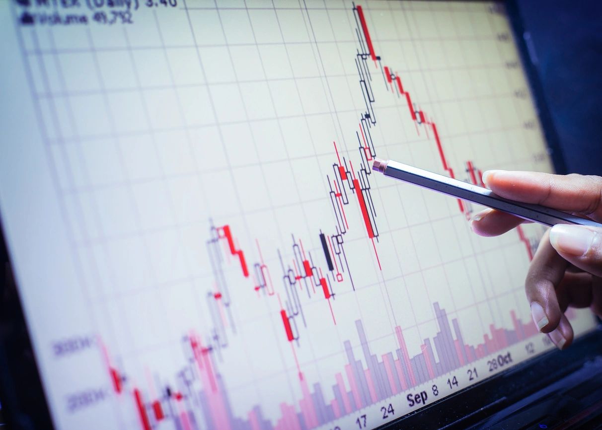
Modern trading platforms offer several chart types, which are crucial when learning how to read a trading chart, each with its unique advantages. Understanding how a Candlestick Chart, for example, is popular for its rich detail—they show the open, high, low, and close for each time period, offering immediate insights into market sentiment. Bar charts provide similar data in a streamlined format with clear open-close markers, while line charts connect closing prices over time to reveal long-term trends with minimal clutter.
With these visual tools at your disposal, you’re now ready to delve into the fundamental building block of these charts—the candlestick—and learn how it reveals market behavior.
Candlestick Basics: Interpreting Price Action
When learning how to read a trading chart, candlestick patterns are critical for forecasting reversals, each encapsulating the market’s sentiment during a specific period. Each candlestick comprises a body and wicks (or shadows). The body represents the opening and closing prices, while the wicks mark the highest and lowest prices reached.
For instance, visualize a candlestick that opens at $100, rises to a high of $115, drops to a low of $90, and closes at $110. This pattern reveals that despite a temporary dip to $90, buyers ultimately drove the price higher, closing at $110—a bullish sign indicating strong buying pressure.
Now that you understand the anatomy of a candlestick, let’s explore how these individual elements come together in recognizable patterns that signal market shifts.
Candlestick Patterns: How They Help You Read a Trading Chart & Recognizing Market Signals
Understanding how to read a trading chart starts with interpreting candlesticks, which form the foundation of chart analysis. Candlestick patterns are critical for forecasting reversals and continuations in the market. Consider the Hammer—a candlestick with a small body and a long lower wick. This pattern typically appears after a downtrend, suggesting that sellers pushed prices down significantly, but buyers stepped in to drive the price up, signaling a potential reversal. Historical case studies have shown that Hammers, particularly when found near support levels, can precede significant upward moves.
Similarly, the Bullish Engulfing pattern—where a large green candle completely engulfs a preceding red candle—indicates that buyers have taken control. Conversely, patterns like the Shooting Star signal that even though buyers pushed prices higher, sellers regained dominance, hinting at a bearish reversal.
With these patterns in mind, the next step is to understand how they fit into the broader market context by identifying prevailing trends.
Identifying Market Trends
Understanding how to read a trading chart includes recognizing market trends that provide context for candlestick patterns. An uptrend is characterized by higher highs and higher lows, while a downtrend features lower highs and lower lows. In range-bound markets, prices oscillate between clear support and resistance levels.
Trendlines are a practical tool for visualizing these trends. For instance, in an uptrend, drawing a line that connects at least two higher lows helps confirm the market’s upward momentum. Additionally, volume plays a vital role—rising volume during an uptrend confirms strong buying interest, while declining volume in a downtrend may indicate weakening momentum.
Having established how to recognize trends, let’s now turn our attention to technical indicators, which further enhance our ability to interpret chart data.
Key Technical Indicators for Beginners
Technical indicators are essential when learning how to read a trading chart, adding a layer of quantitative analysis to chart interpretation, confirming and refining your insights.
Moving Averages (SMA & EMA)
Moving averages smooth out price fluctuations to highlight the underlying trend. The Simple Moving Average (SMA) calculates the average price over a specified period, while the Exponential Moving Average (EMA) gives more weight to recent prices. For example, if the price remains above a 50-day EMA, this suggests a sustained uptrend. Crossovers between short-term and long-term moving averages can signal potential trend reversals.
Relative Strength Index (RSI)
The RSI is a momentum oscillator that measures the speed and change of price movements on a scale from 0 to 100. Typically, an RSI above 70 may indicate overbought conditions, though in strong uptrends, prices can remain elevated; therefore, divergence between price and RSI is often a more reliable signal of a reversal. Conversely, an RSI below 30 might suggest oversold conditions and a possible bounce.
MACD (Moving Average Convergence Divergence)
MACD is used to identify changes in the strength, direction, momentum, and duration of a trend. It is calculated by subtracting the 26-day EMA from the 12-day EMA. A bullish signal occurs when the MACD line crosses above the signal line, while a bearish crossover indicates a potential downturn. Divergences between MACD and price can also signal an impending reversal.
Stochastic Oscillator
This indicator compares a specific closing price to a range of prices over a given period, helping to identify overbought or oversold conditions. Values above 80 may suggest overbought conditions, while readings below 20 indicate oversold markets—though, as with RSI, divergences are key to making informed decisions.
Volume-Based Indicators
Volume indicators, such as On-Balance Volume (OBV) or the Volume Rate of Change, provide insights into the strength behind price movements. For example, an uptrend supported by increasing volume is a strong signal of sustained buying interest.
Example: Imagine a scenario where a Bullish Engulfing pattern forms near a support level, the MACD line crosses above the signal line, and the RSI is rising but remains below 70. The convergence of these signals suggests that the uptrend is gaining momentum and that entering a long position could be favorable.
Now that you have a comprehensive view of technical indicators, let’s discuss advanced techniques that combine these tools for even greater precision in your trading decisions.
Key Techniques for Reading Trading Charts Effectively
For advanced chart reading, traders often combine multiple indicators to refine their understanding of how to read a trading chart to form a more robust trading signal. For example, combining RSI and MACD can help pinpoint divergences. Consider a scenario where the price is forming lower lows while the MACD is showing higher lows—a bearish divergence that signals a potential reversal. In such cases, fine-tuning your indicator settings, such as adjusting the period of the EMA in the MACD, can yield more timely signals. Although methods like the fractional Kelly Criterion can help optimize position sizes based on these signals, most traders use these advanced techniques cautiously to avoid overexposure.
Imagine the following setup:
RSI: Currently at 65, but starting to decline despite rising prices.
MACD: The MACD line crosses below the signal line, while the histogram begins to shrink.
This convergence suggests that the momentum is shifting, and a potential reversal may be on the horizon. Integrating these advanced signals into your strategy can provide higher confidence when confirming trade setups.
With advanced techniques in hand, let’s briefly review how these insights integrate with your overall risk management framework.
Integrating Chart Analysis with Stop-Loss Strategies
Once you’ve identified strong signals using both candlestick patterns and technical indicators, setting an effective stop-loss becomes critical. For instance, if you enter a trade based on a Bullish Engulfing pattern, placing your stop-loss just below the pattern’s low helps limit your potential loss. This precise stop-loss placement, when combined with dynamic position sizing, ensures that your risk remains controlled no matter what the market does.
Now, let’s see how to apply these concepts across different markets while keeping your risk in check.
Position Sizing for Different Markets
Different asset classes demand tailored approaches to position sizing due to varying volatility and risk factors.
Stocks
For stock trading, suppose you have a $10,000 account and are willing to risk 2% per trade ($200). With a stop-loss of